if a people were planets is a book of poems and illustrations that chronicles a girl searching for understanding in the people and relationships surrounding her and getting swept up in the worlds she feels they exist. As she tries to find herself in others, she continuously feels less and less understood.
The poems and imagery are directly inspired by my experience as an autistic woman. The poetry gives insight and context to the character’s feelings and the type of social relationship the planets represent. While illustrations explore how emotions, senses, and anxieties would be corporealized if they were an environment you’d have to interact with.
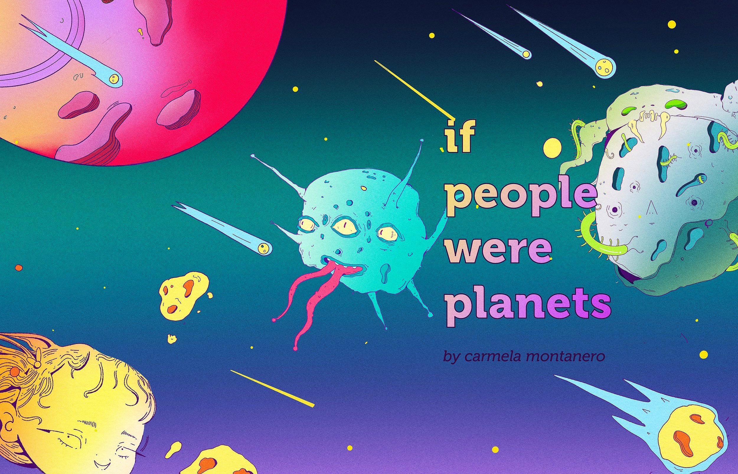
IF PEOPLE WERE PLANETS
POETRY BOOK
Art Instructor: Paul Kepple, Tyler School of Art and Architecture, Temple University
Publishing, Illustration, Typography, Layout
READ THE BOOK
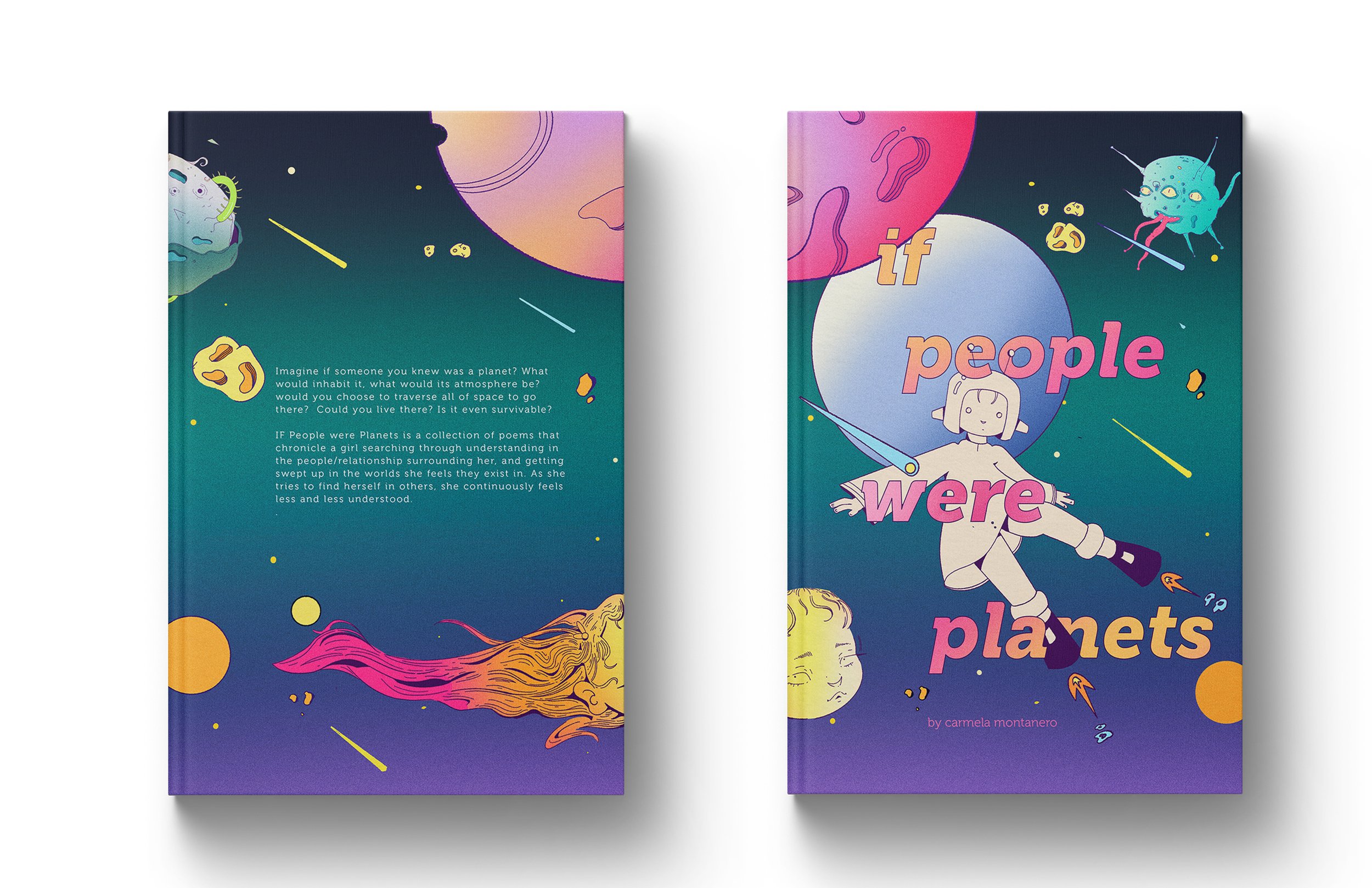
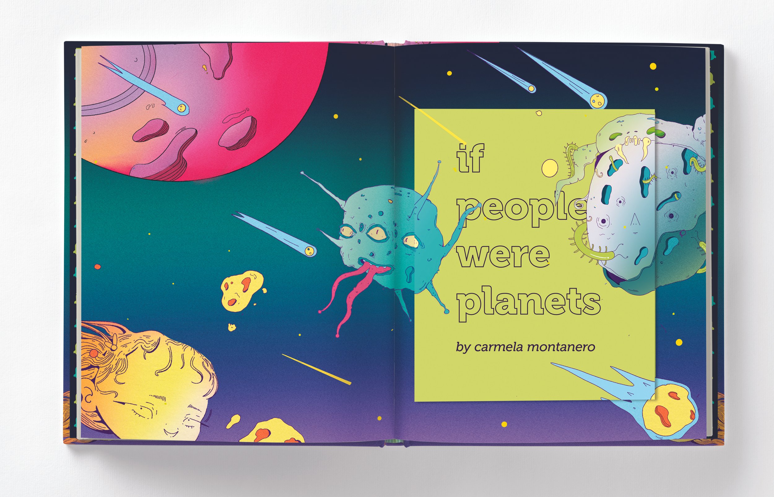
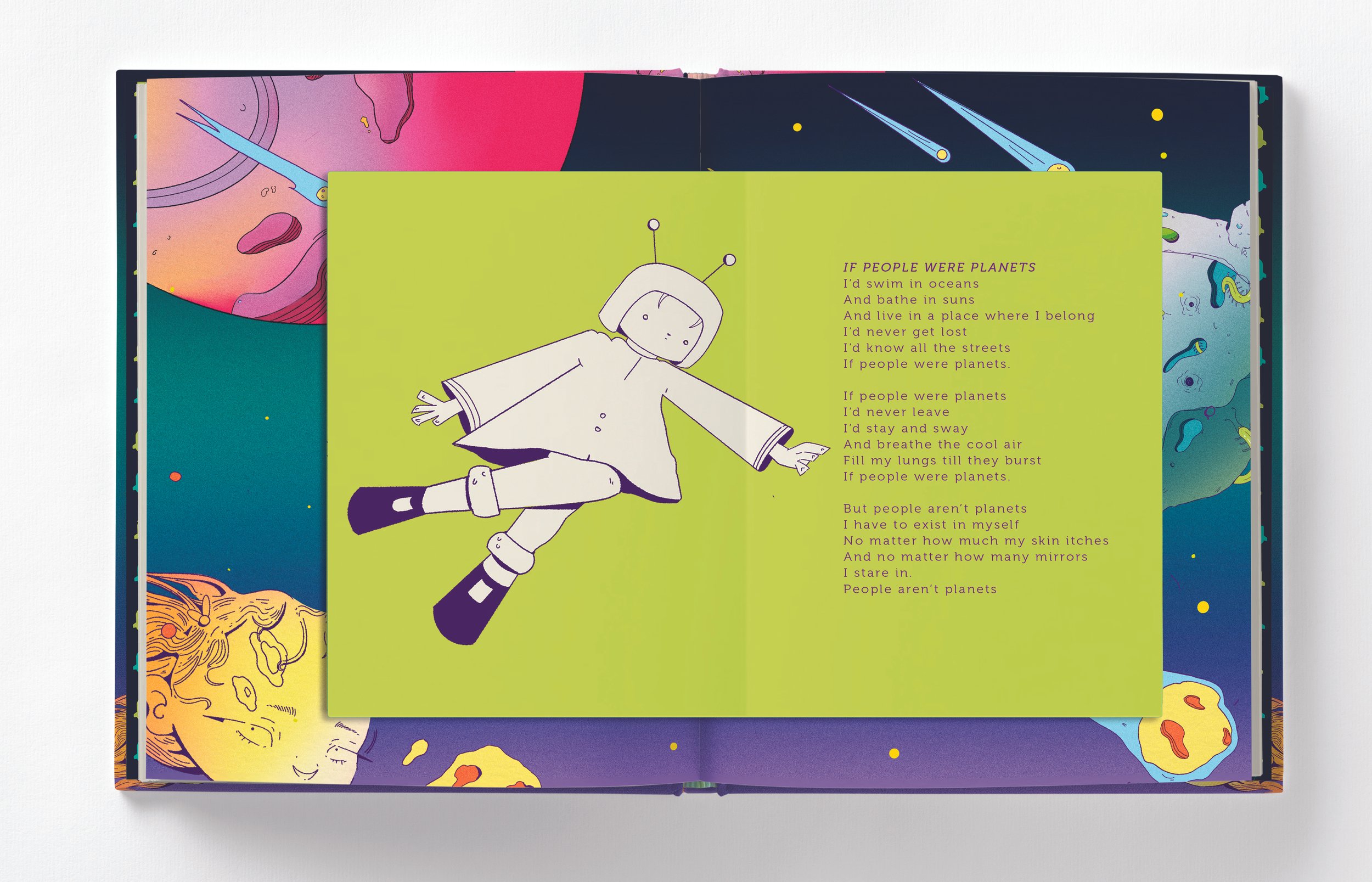


“Imagine if someone you knew was a planet? What would inhabit it, what would its atmosphere be? Would you choose to traverse all of space to go there? Could you live there? Is it even survivable?”
— SYNOPSIS
DESIGNING THE LAYOUT:
CHAPTER OPENERS
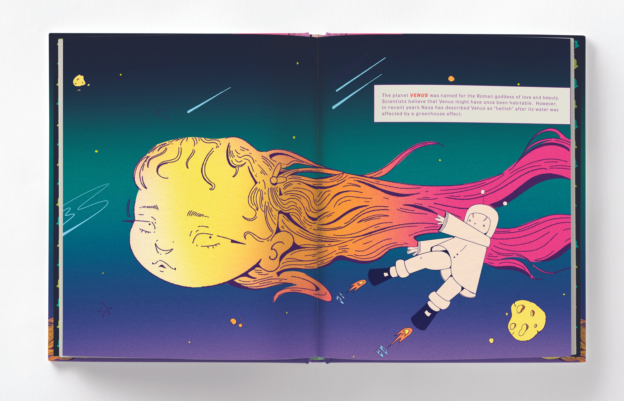
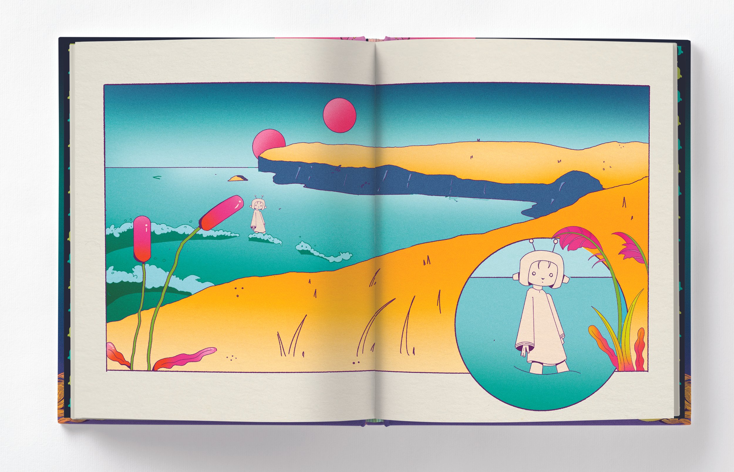
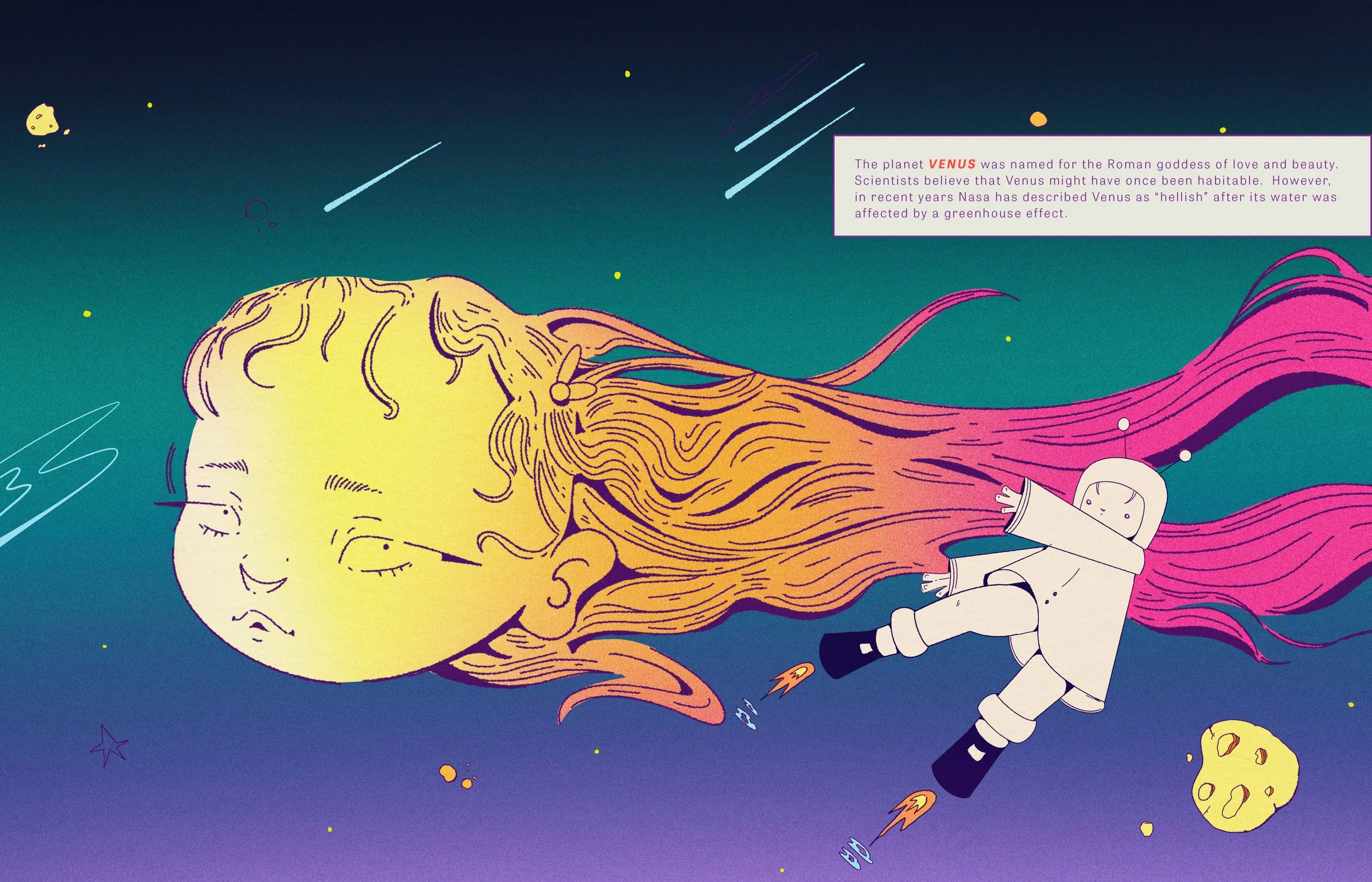
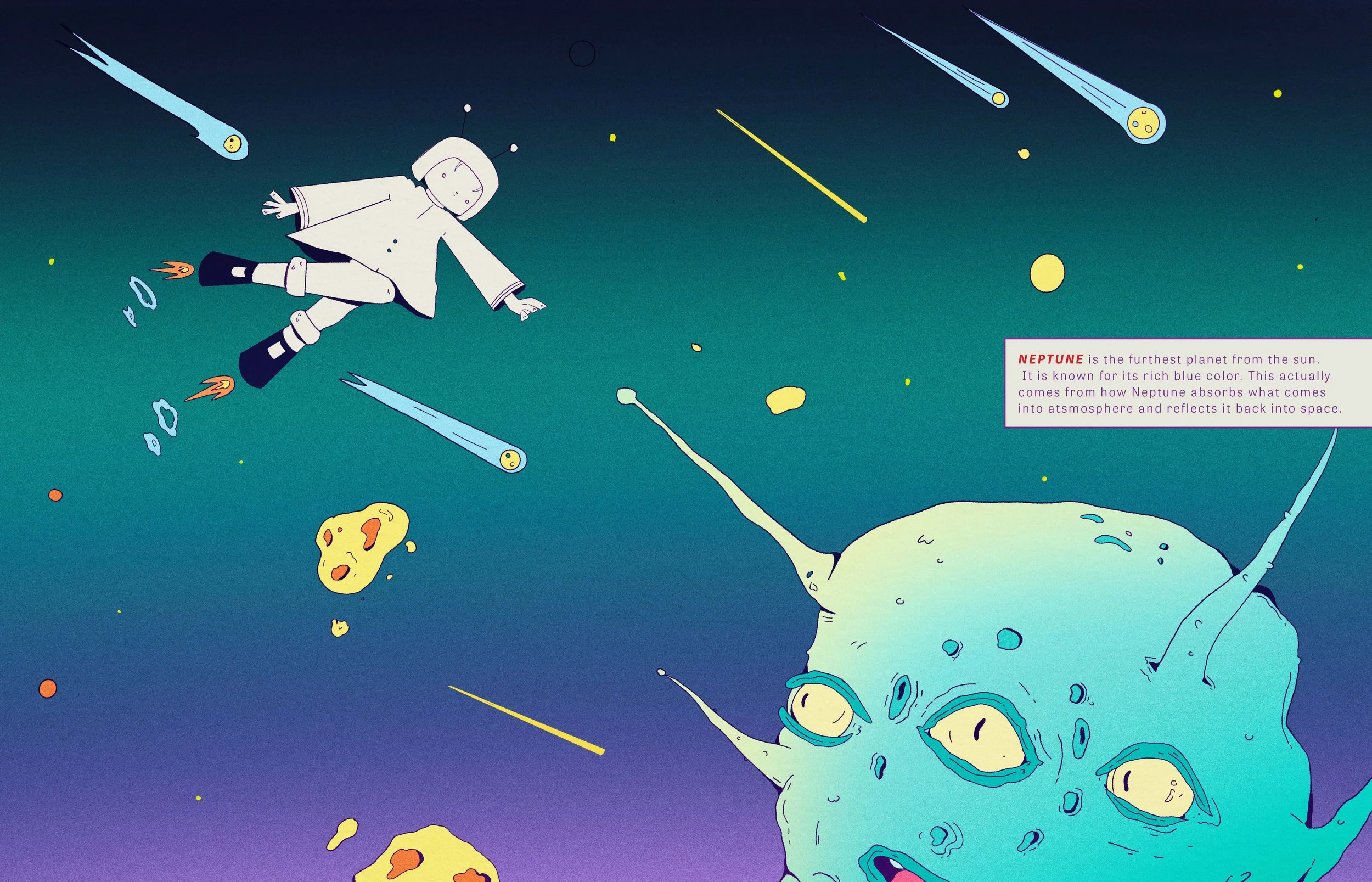
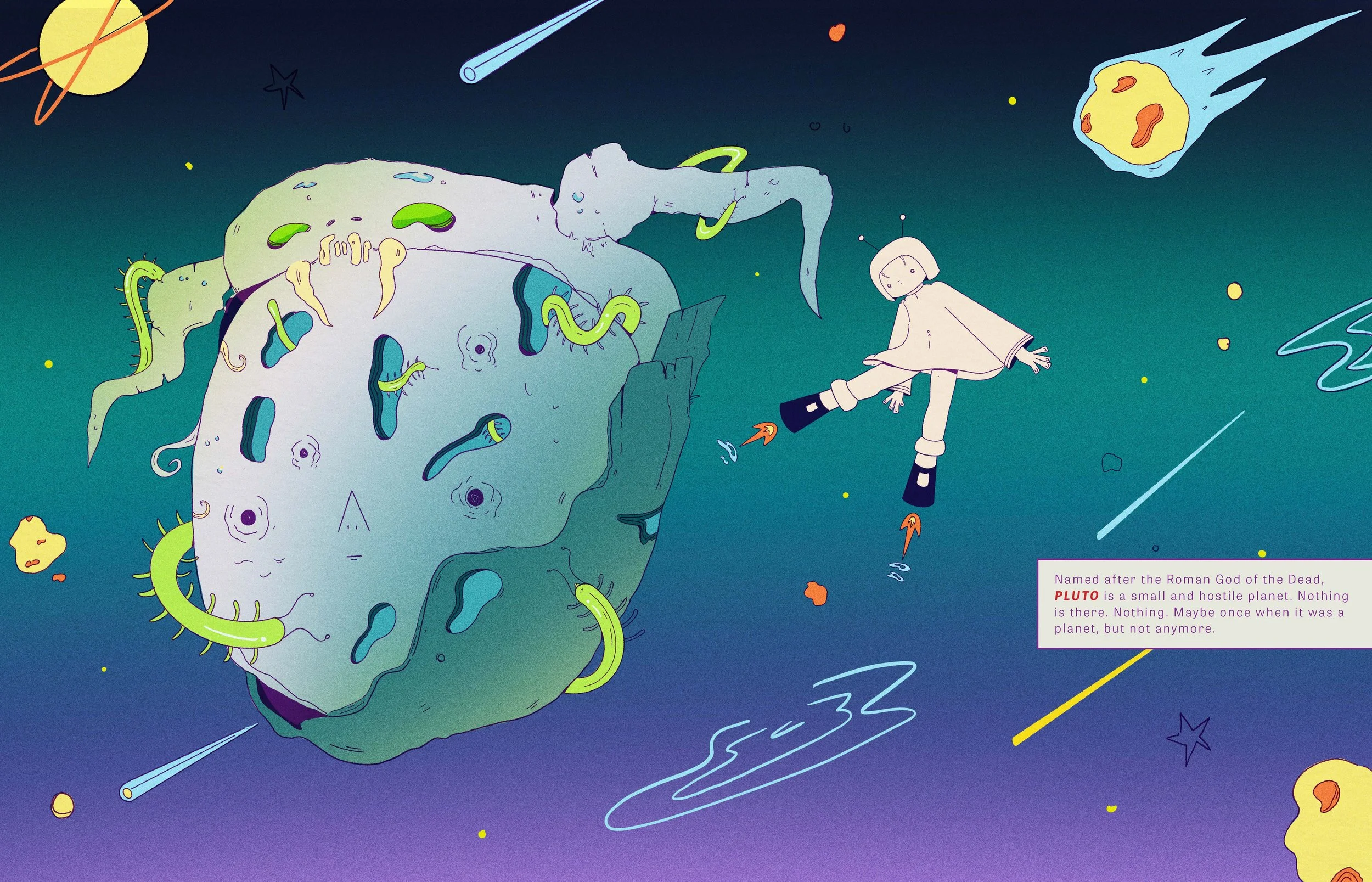
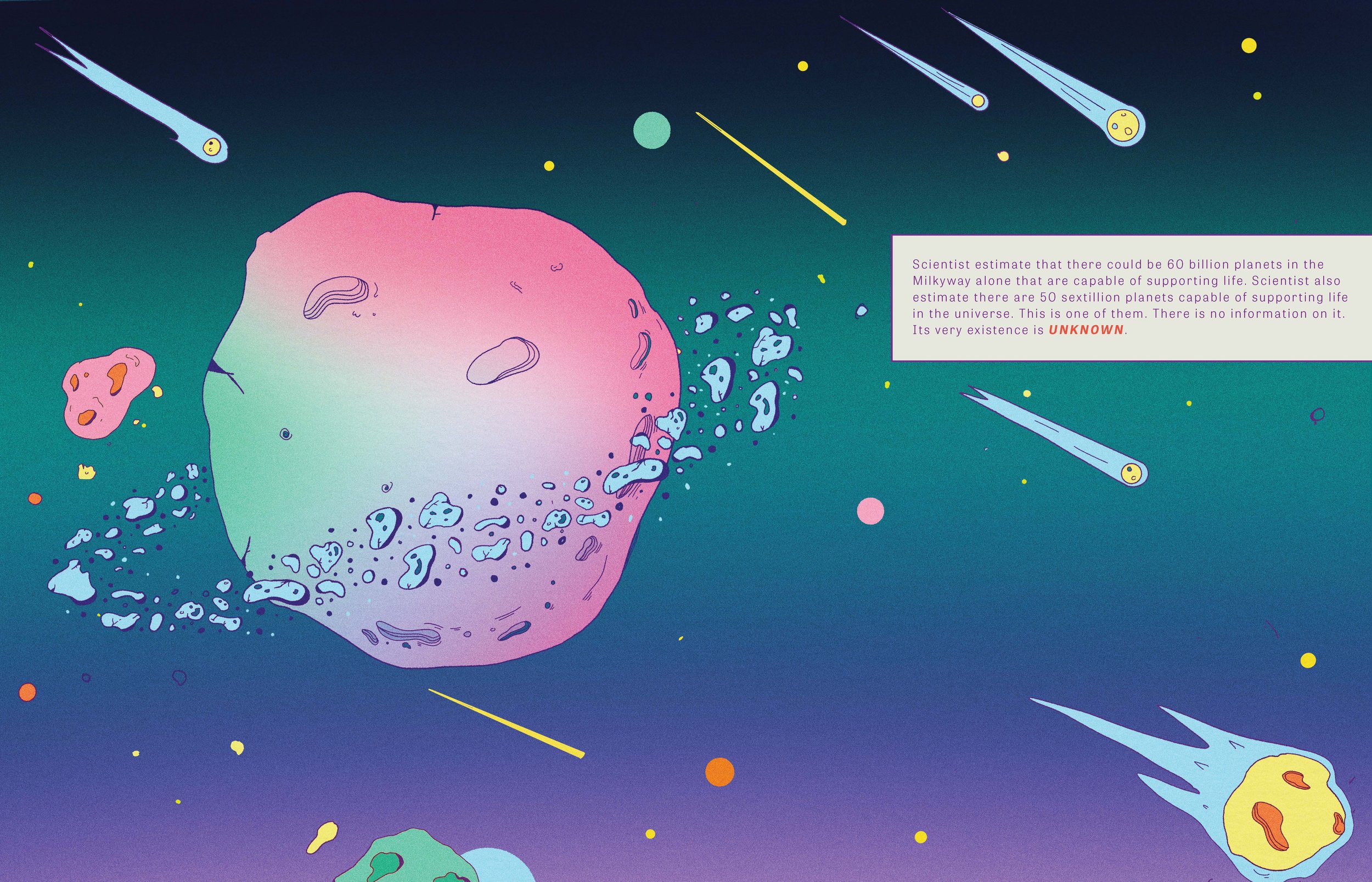
The finished design is 27 spreads, including end pages, front cover and back cover. Each spread is fully colored and inked. There is a total of 6 poems and 5 planets. In order to effectively tell the story, designing the layout was crucial to the project’s success. Each ‘chapter’ opens with a full spread illustration of the main character arriving to a new planet. The planet is briefly introduced with factual information that relates to fictional environment in consequential spreads.
-
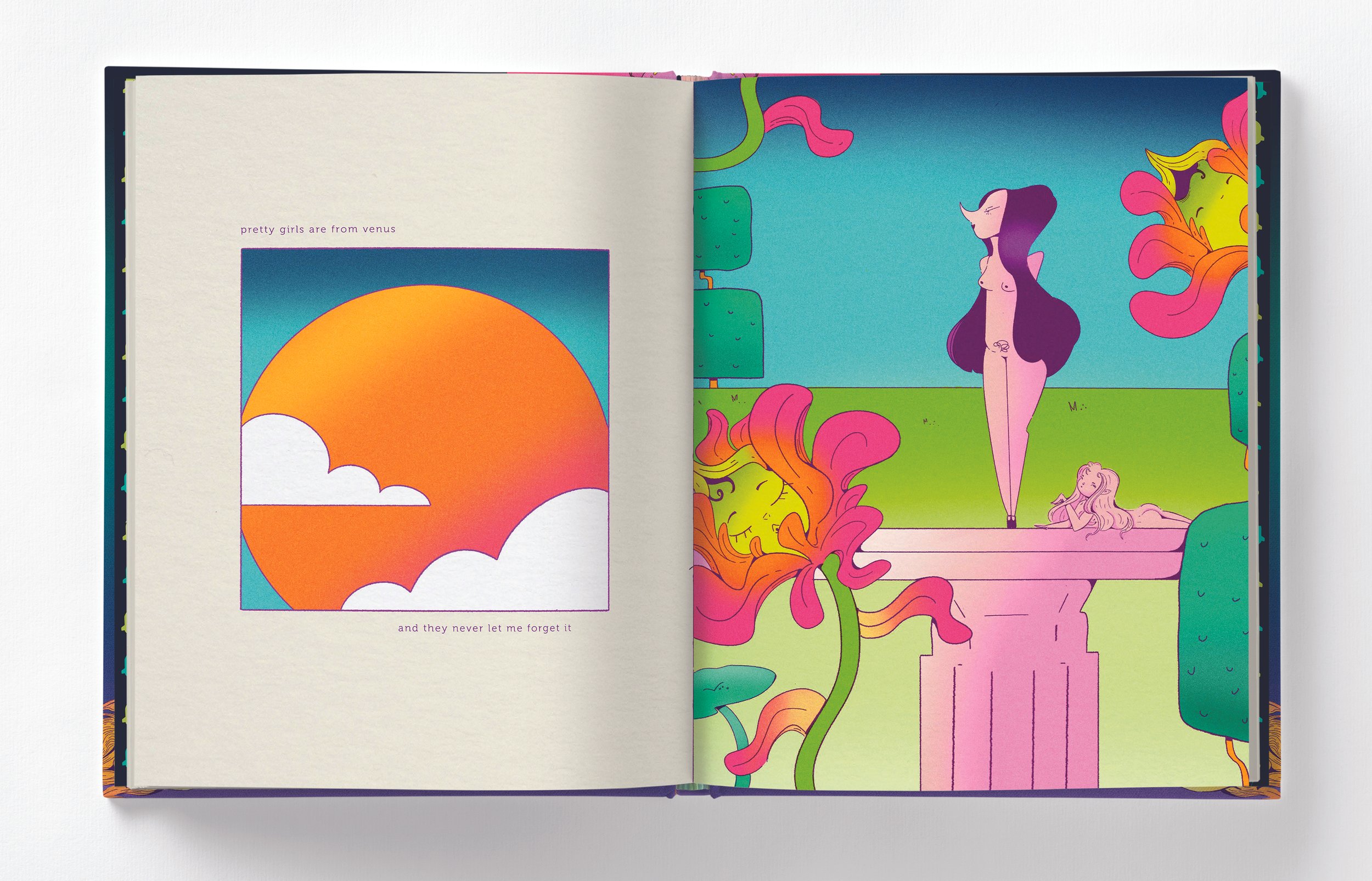
![]()
VENUS
-
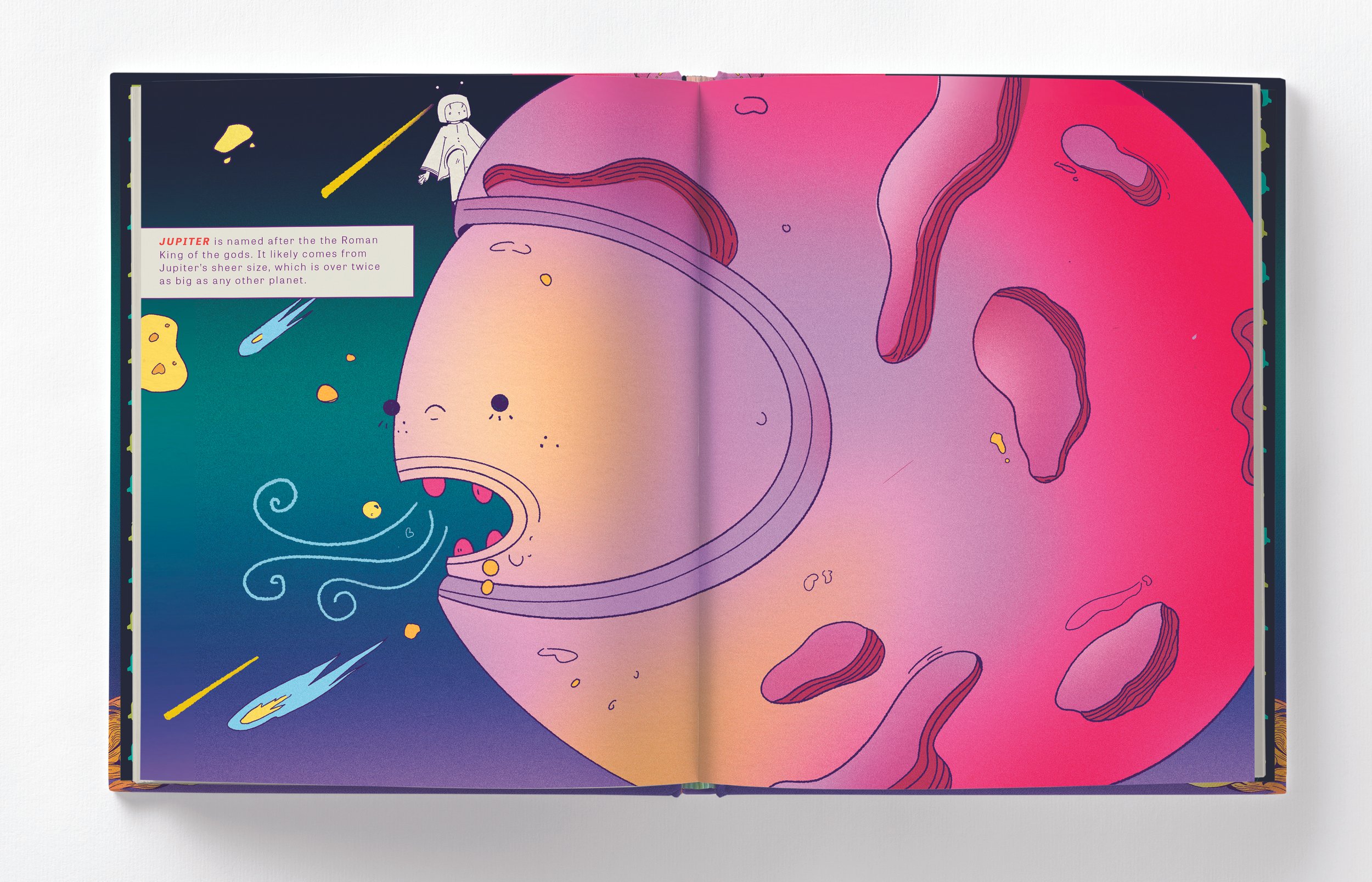
![JUPITER]()
JUPITER
-
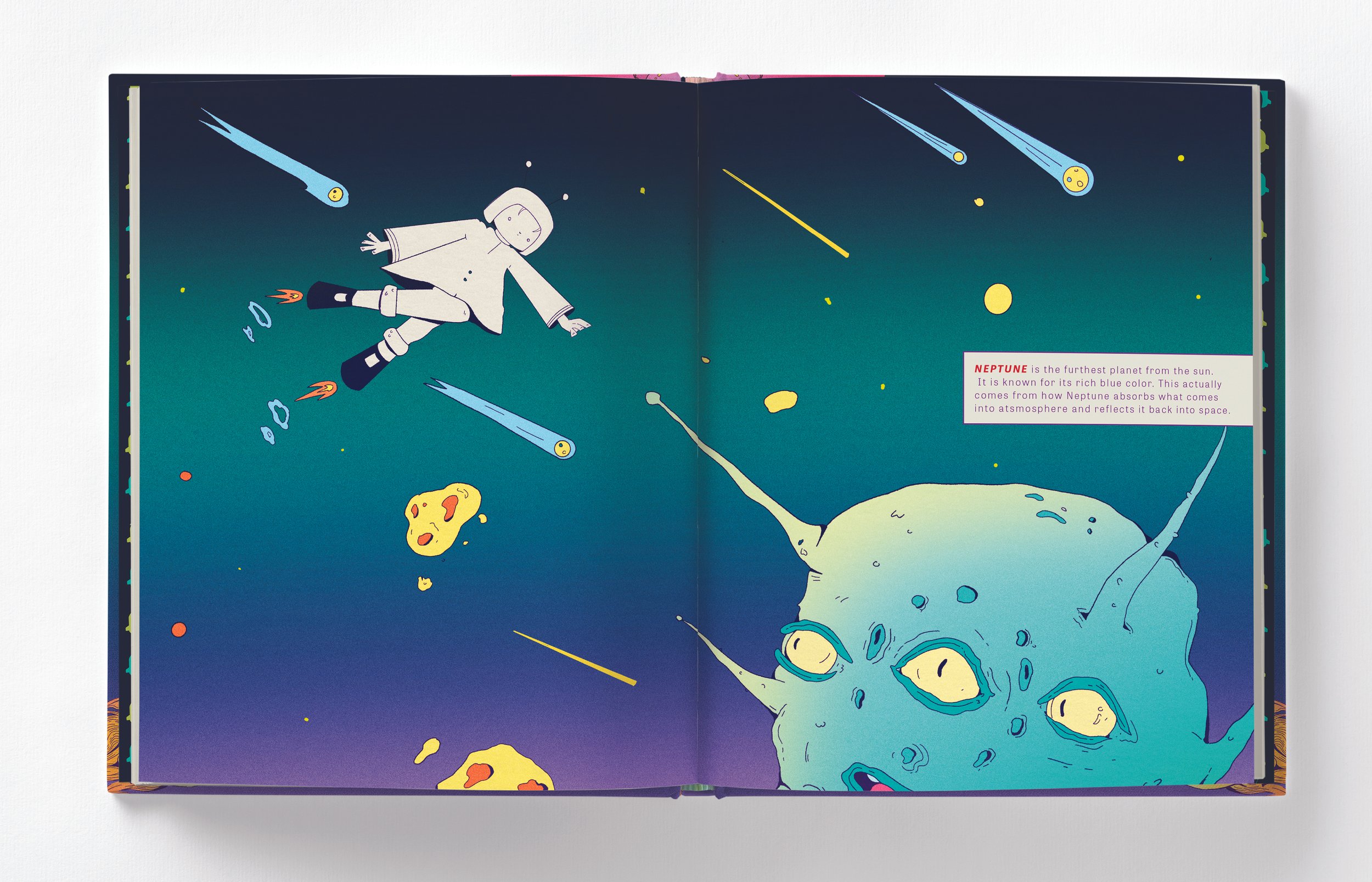
![NEPTUNE]()
NEPTUNE
-
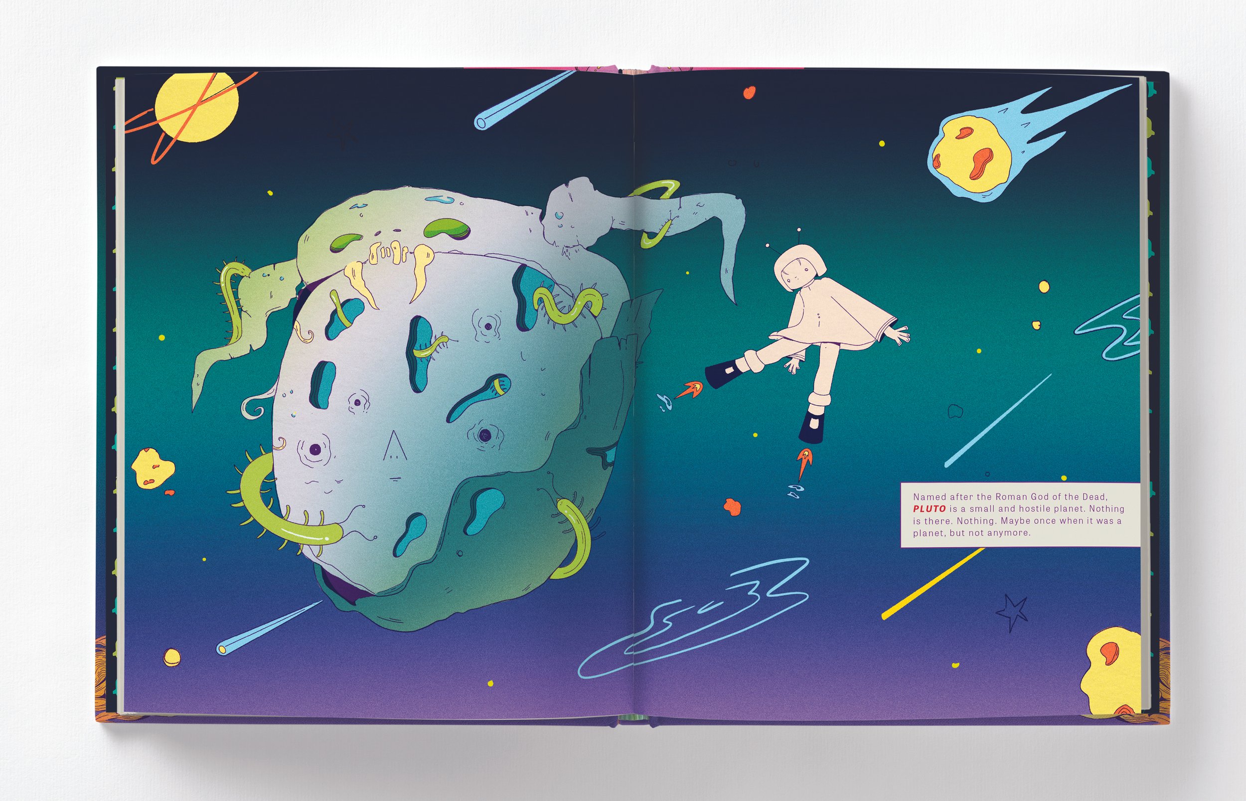
![PLUTO]()
PLUTO
-
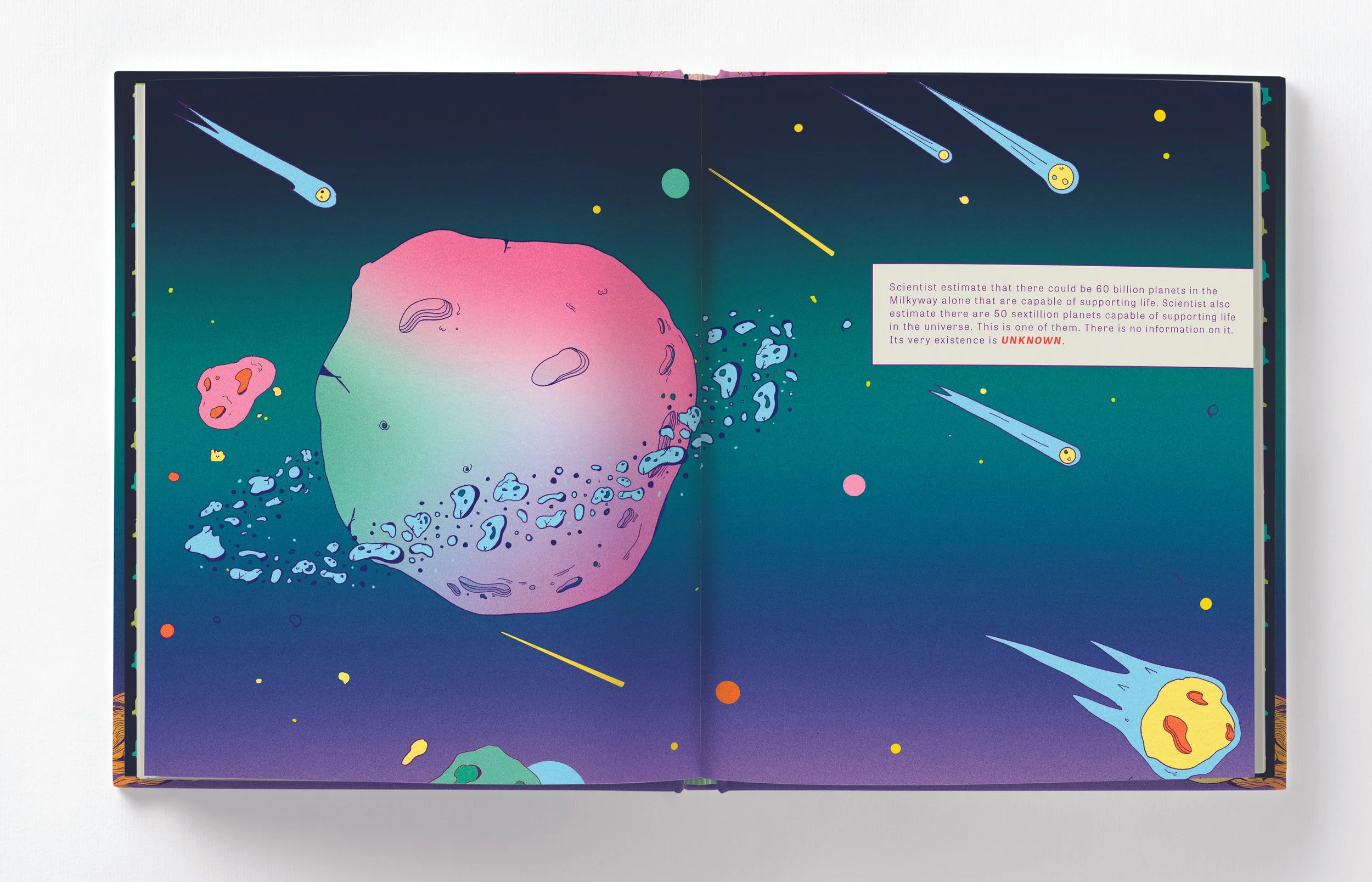
![]()
UKNOWN

A CLOSER LOOK
The planet openers are designed differently then the poems for a few reasons. While it mostly helps to break up the book and signal a new chapter, the color and typography are also treated differently. A clean, tech-y sans-serif is used to evoke a more scientific vibe compared to the more poetic nature on the chapter’s contents. The colors in each chapter opener progressively get cooler to cue that the protagonist’s journey takes her further and further from the sun. This not only works from a scientific standpoint, but also represents a loss of hope and increased feeling of isolation.


DESIGNING THE LAYOUT:
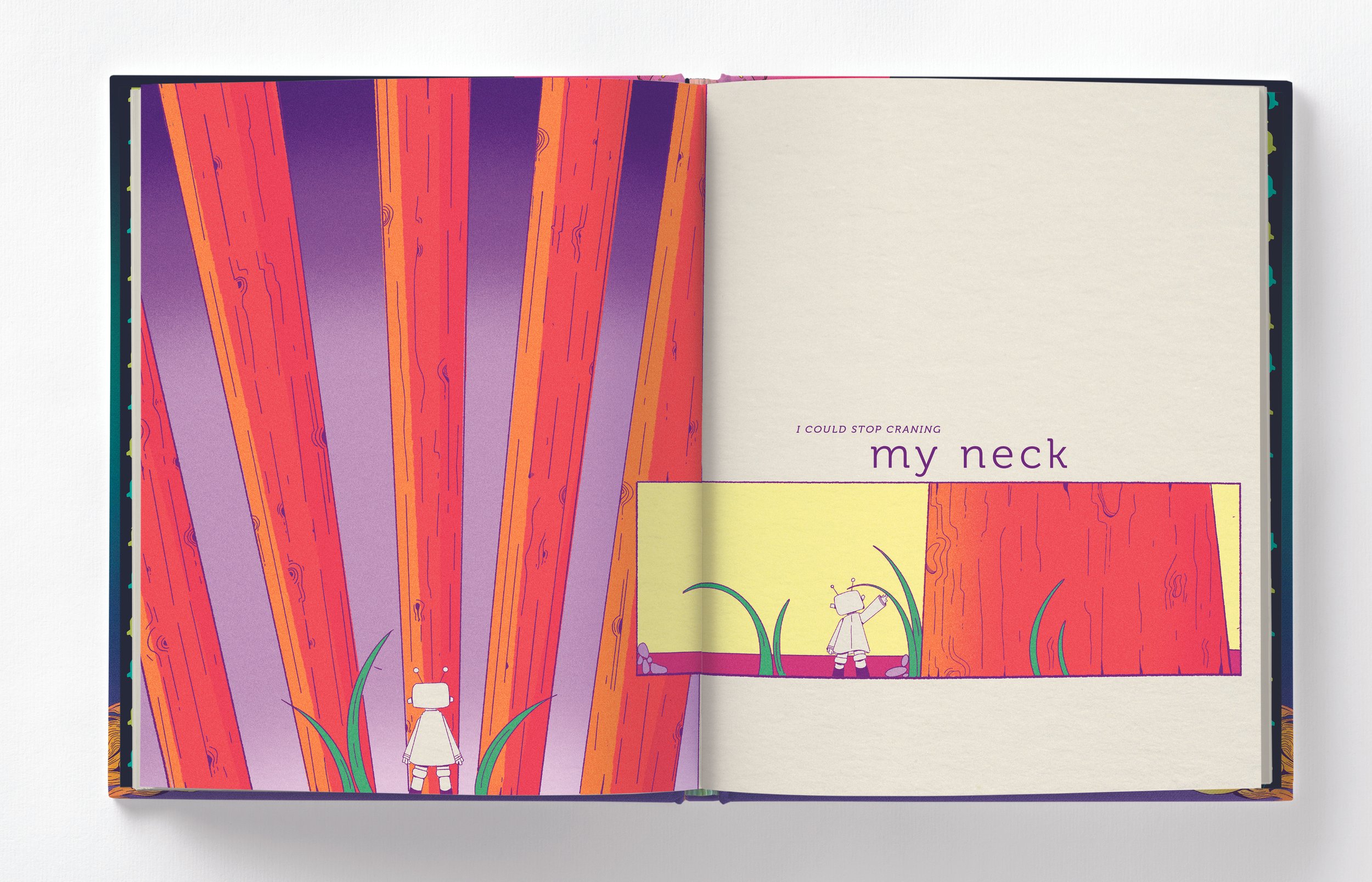
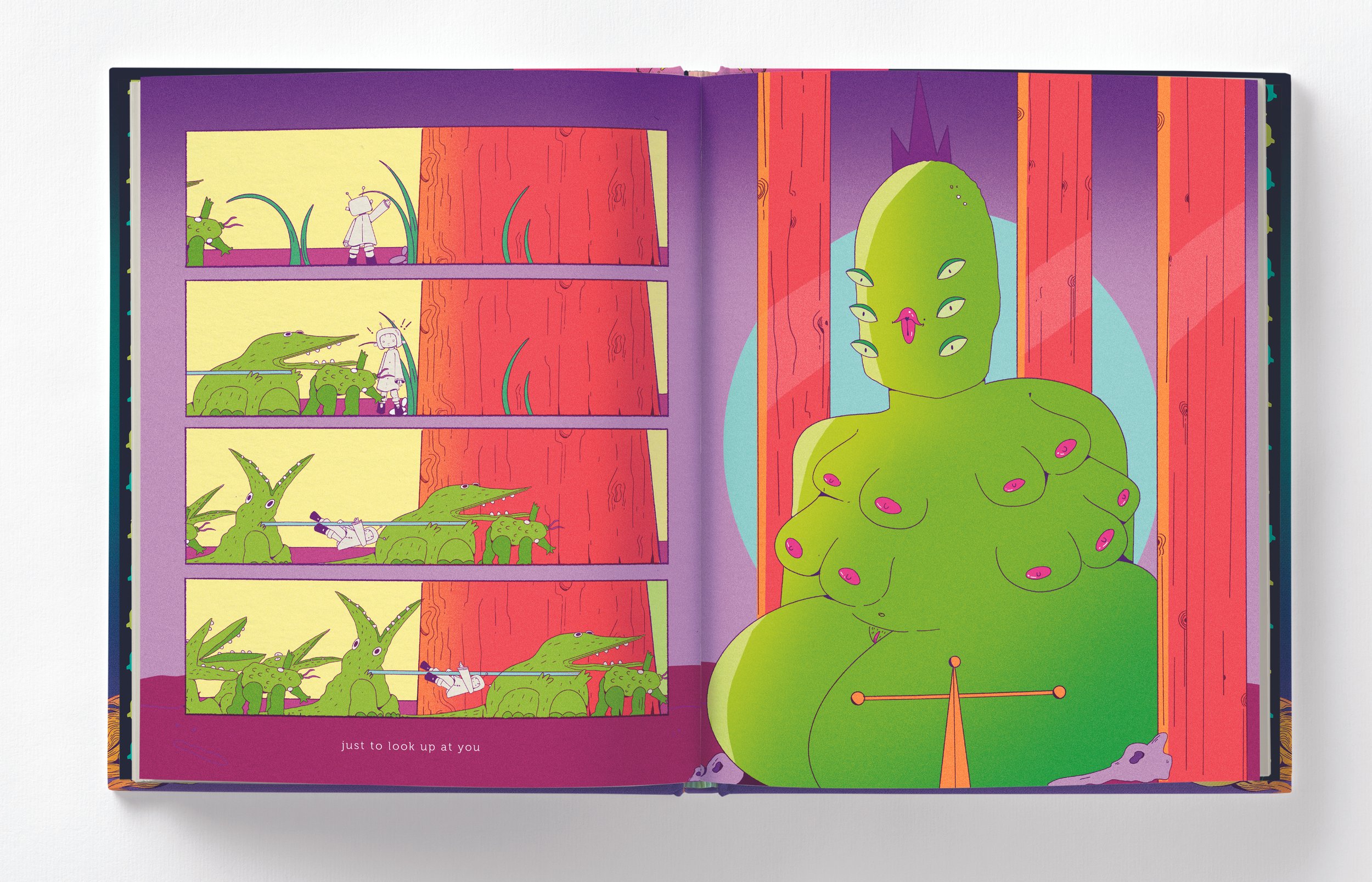
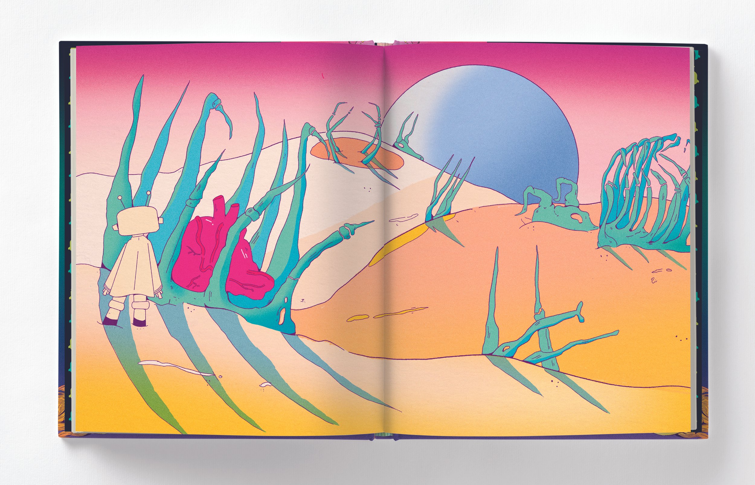
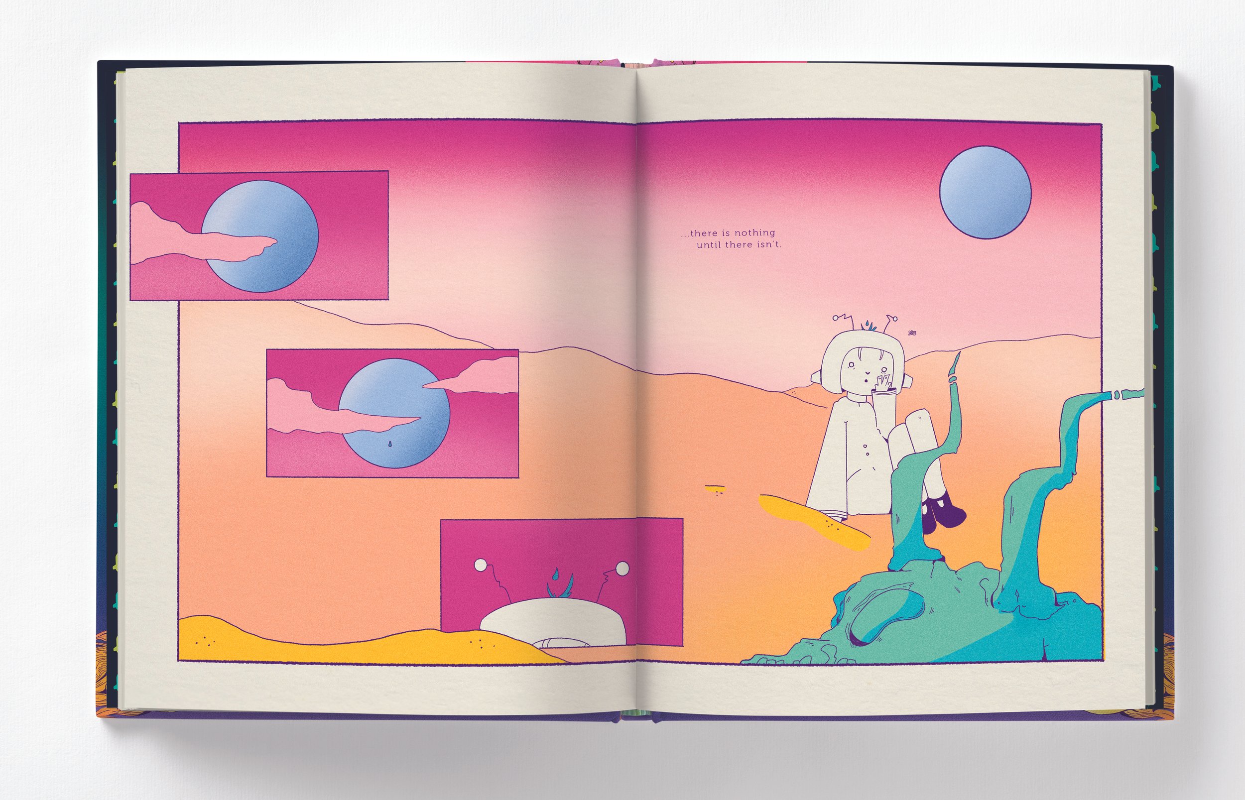
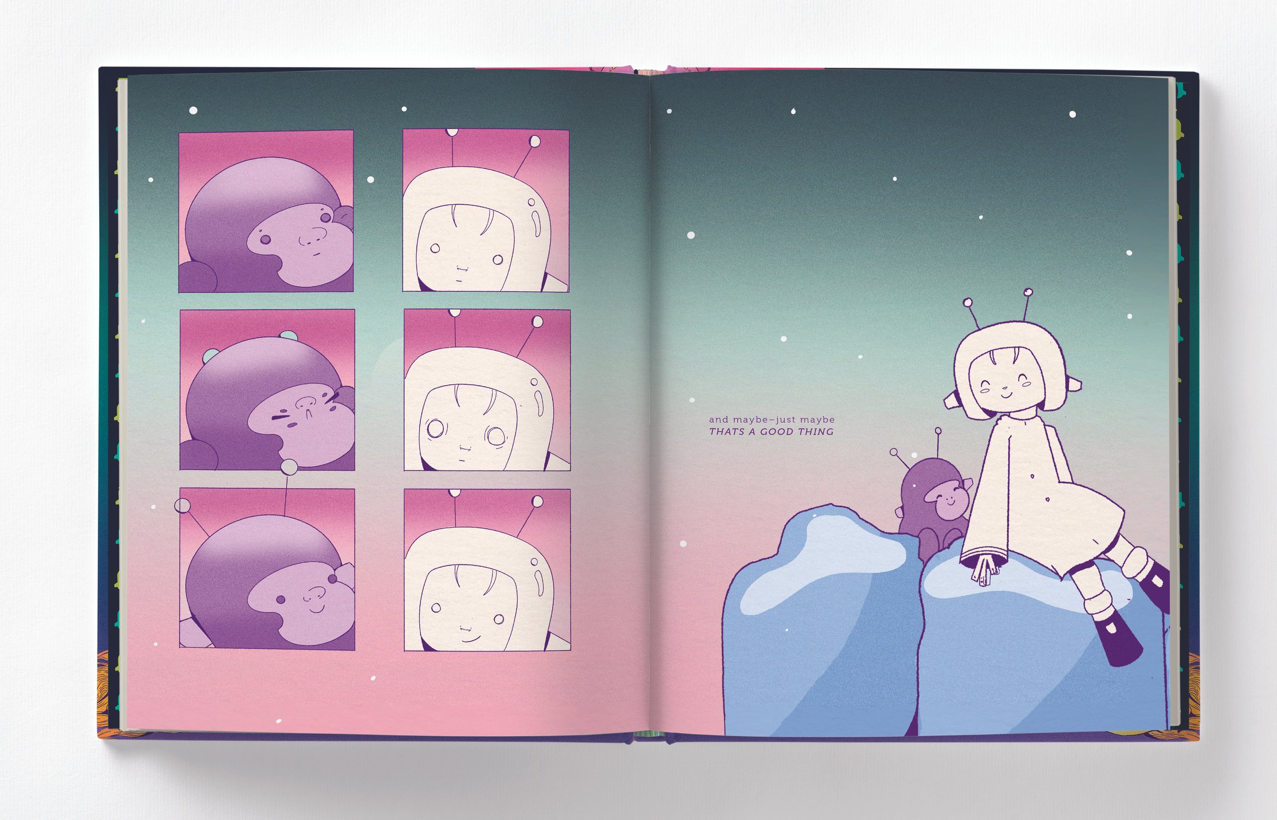
SEQUENTIAL STORY TELLING
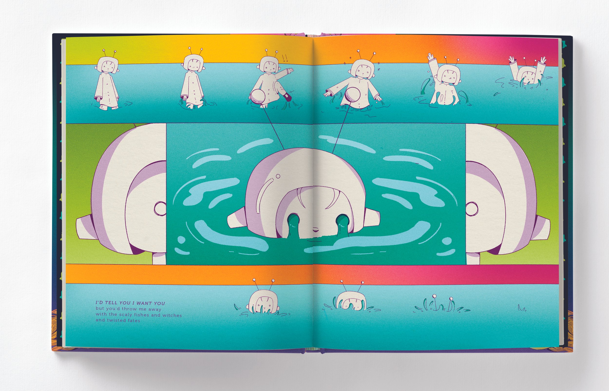
One particular challenge when designing this book was being able to tell a sequential story without feeling to comic bookish. Artist like Chris Wares inspired me to explore breaking up the composition in a purposeful way. While panels are used throughout the book, they aren’t used to just display an action. Instead, they help pull out details or show subtle changes in time. Color, repetition, and detail shots were used to achieve this.


A CLOSER LOOK…
SOME MORE SEQUENTIAL STORYTELLING
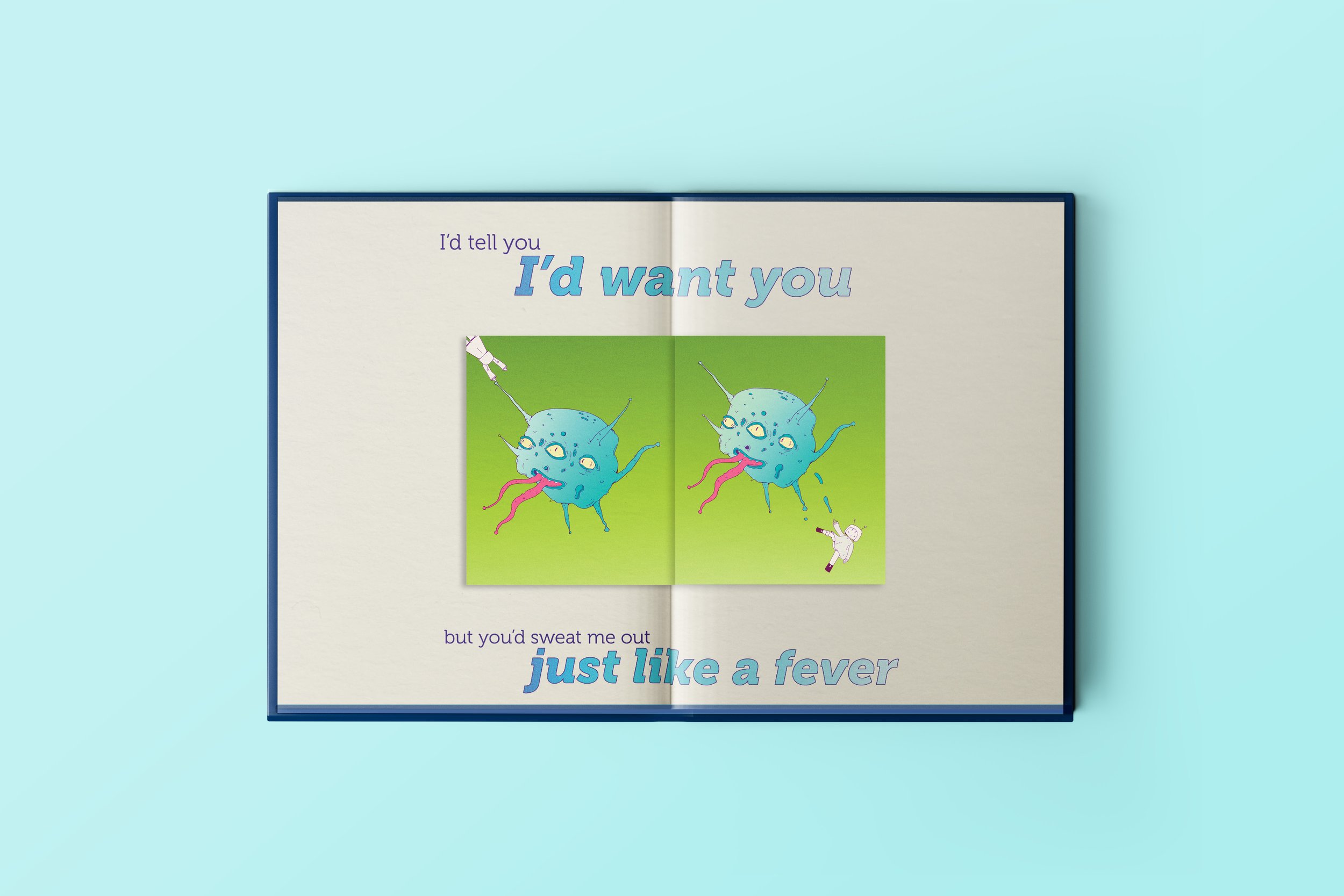
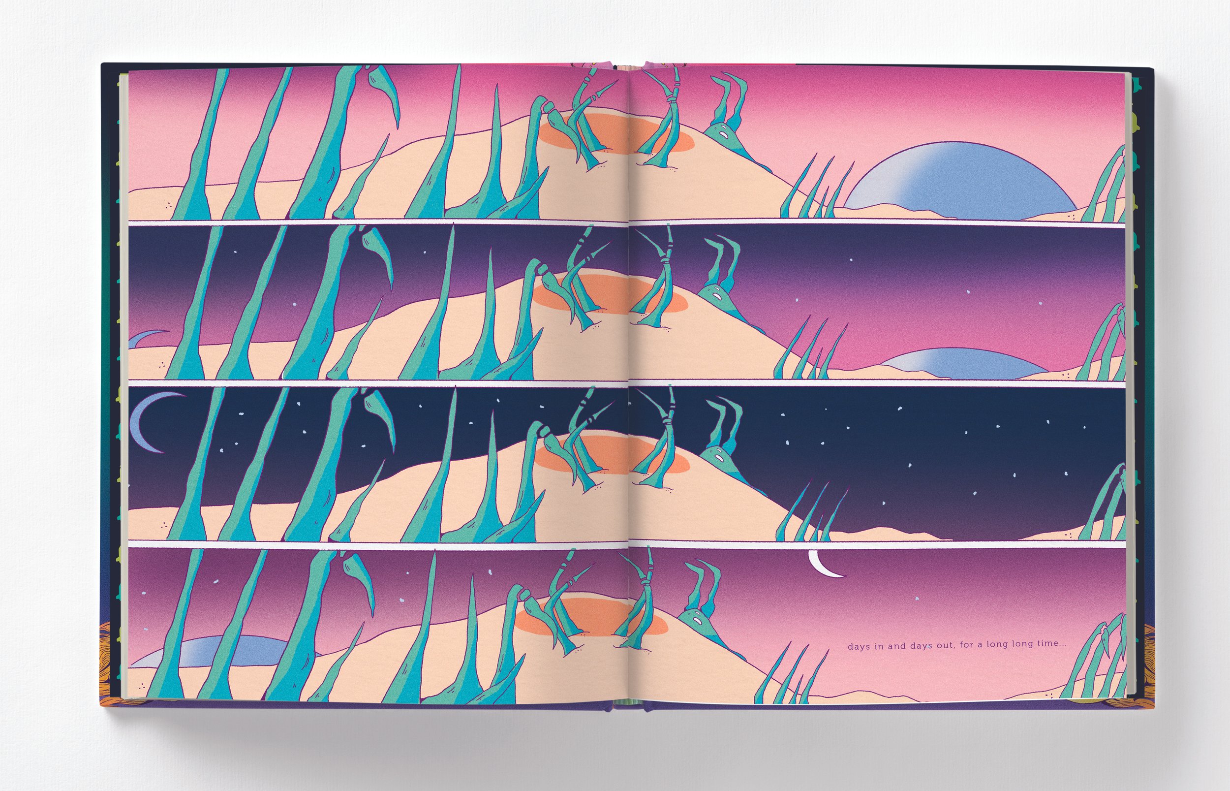
One specific area where sequential storytelling was crucial was on the planet Neptune. This planets’ poem focuses on codependency and features the protagonist being absorbed into the planet. This includes a spread fold out, so the reader can see changes to the planet over time

DESIGNING THE LAYOUT:
ENDPAGES
Of course, when doing a book, you need endpages! I tried to to keep these graphic to contrast with the more illustration based interior.
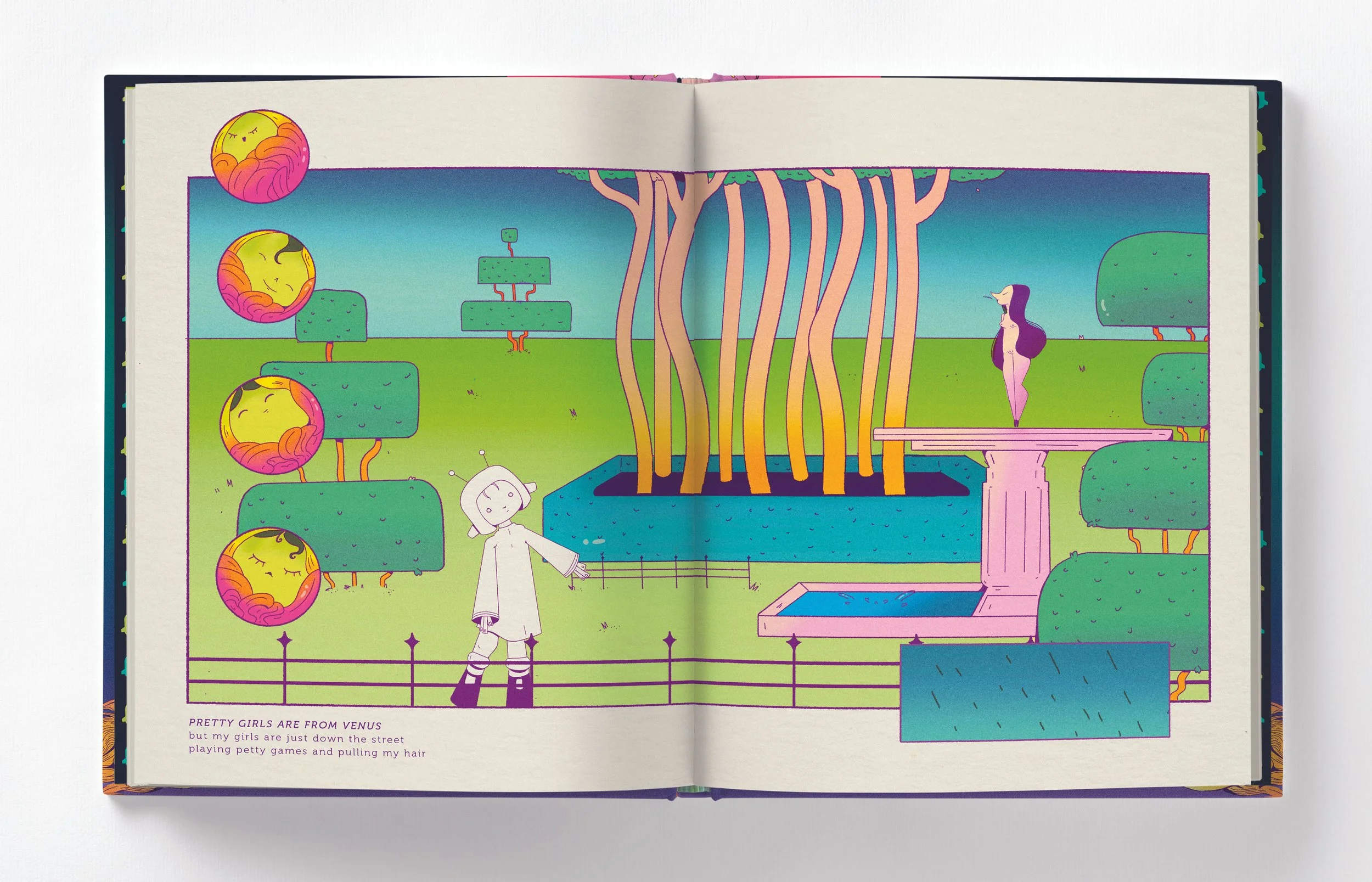
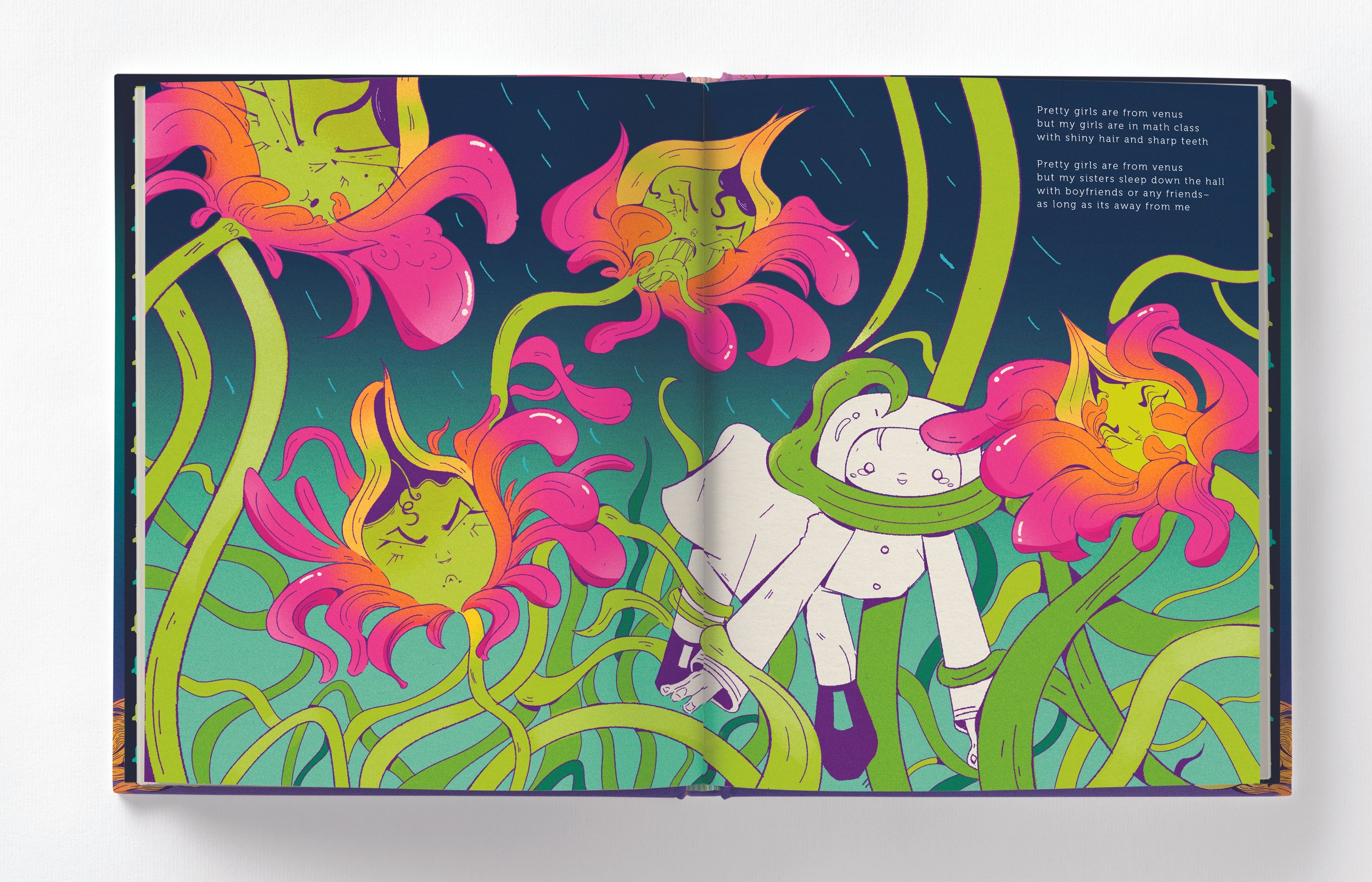
Is the idea that she goes to each planet and tries to try & fit into other ppl lives & how they live & each planet she tries to live at has certain things that make her uncomfortable bc they r not her
— my sister, via text when I pitched the idea
In If People are Planets, relationships are corporealized into tangible and often dangerous environments as a way to explore the protagonists hope to find acceptance in other people. The imagery is based on my own anxieties and fears I experience when trying to ‘fit in’ or be like others.
ILLUSTRATION PROCESS:
ITS ALL ABOUT CONCEPT
Illustration Process:
BEGINNINGS
Some initial sketches and thumbnails included the character design (middle), thumbnails of layout (left), and how each planets environment would be (right)


Rough sketch to inking
My approach to coloring was fairly simple, flat areas with lots of gradient and little of bit of noise. However picking colors was a little bit trickier. Below are some color experiments and a little bit on why specific changes were made.
ILLUSTRATION PROCESS:
COLOR EXPLORATION
Initially the colors were pretty straigtforward, green grass, blue sky, etc. Lots of primary and secondary colors. However this wasn’t feeling very alien.


After getting some advice and shifting the hues, I was able to get a more alien look. Greens either became cyan or lime. Reds became florescent pinks. This helped to add an other worldly feel to the illustrations.
Once I picked out my colors, I struggled with deciding where to use them. For a while I experimented with this super neon look. While it definitely achieved the alien look, it was a little too acid like. This was because every aspect of the illustrations were the same brightness with no contrast

Making some of the colors a little less acidic and adding contrast between the different elements of the page made a big difference!

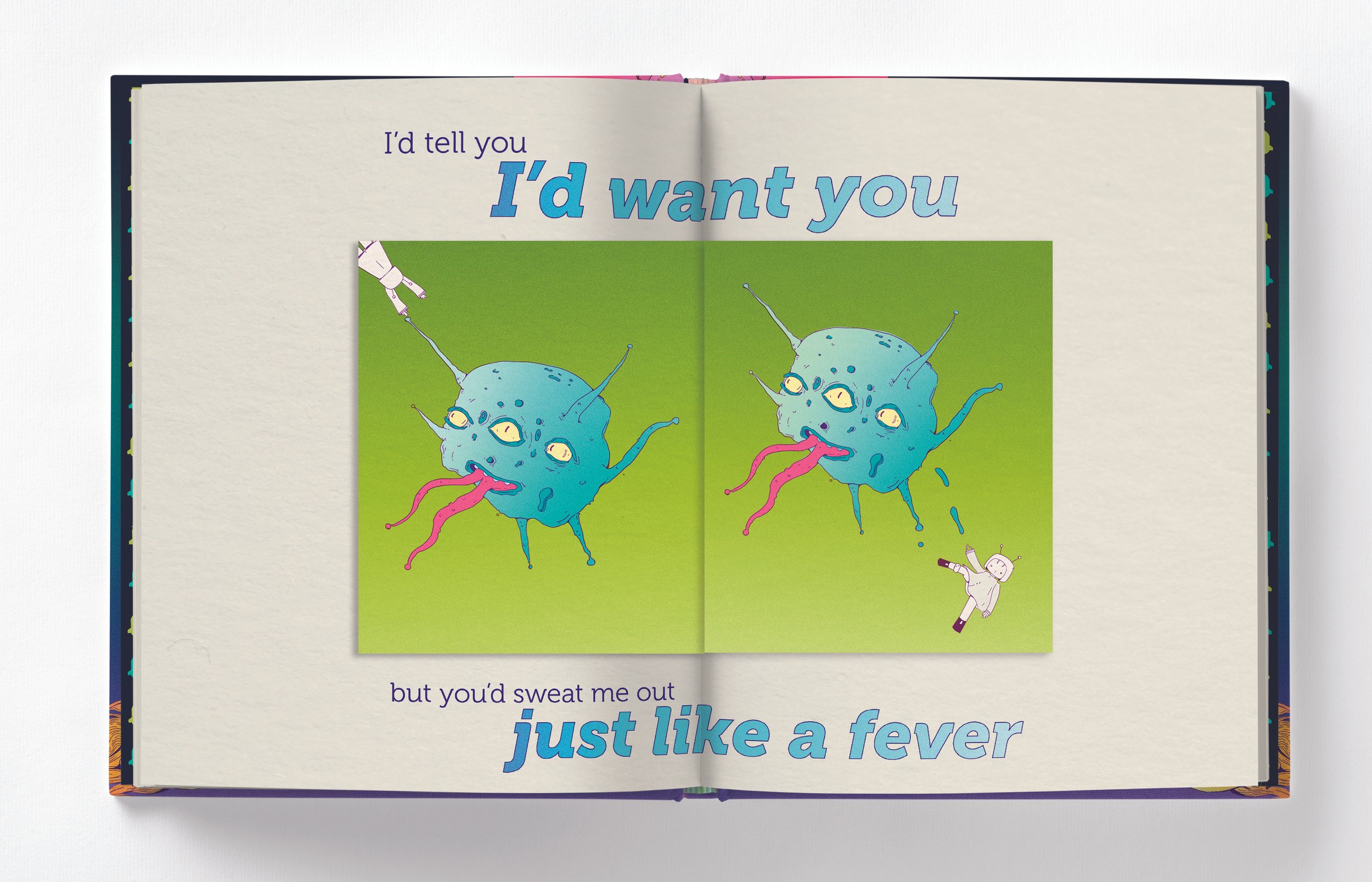
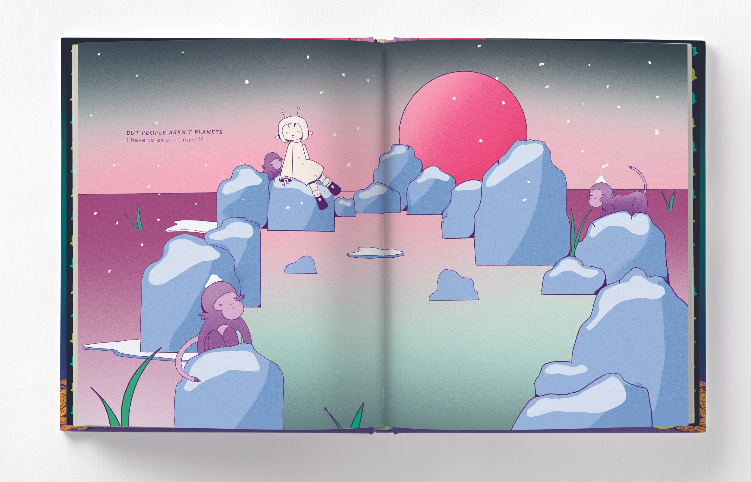
“I have to live in myself– and maybe just maybe thats a good thing.”
— Last line of final poem, If People Were Planets
RESULTS
As a graduating designer and illustrator, I wanted my thesis to incorporate my interest in publishing, illustration and story telling. More importantly, I wanted to take the opportunity to create a deeply personal project. While the poems and illustrations may be informed by my own life, I hope that it speaks to a wide variety of people feel pressure to fit in.
If People Were Planets received the Tyler School of Art and Architecture Alumni Award: Best Senior Thesis Project and was accepted in Society of Illustrators Student Exhibition.


