GIRL TALK HORROR ZINE
Girl Talk is a horror zine that focuses on the awkward, painful and downright terrifying experience of puberty for girls. Informed by a mix of my own life, TV and movies, and horror tropes, Girl talk explores the unbridled terror of girlhood. The 36 page zine takes a look at a variety of issues girls face, including body dysmorphia, social pressures, transformation and changing relationships.
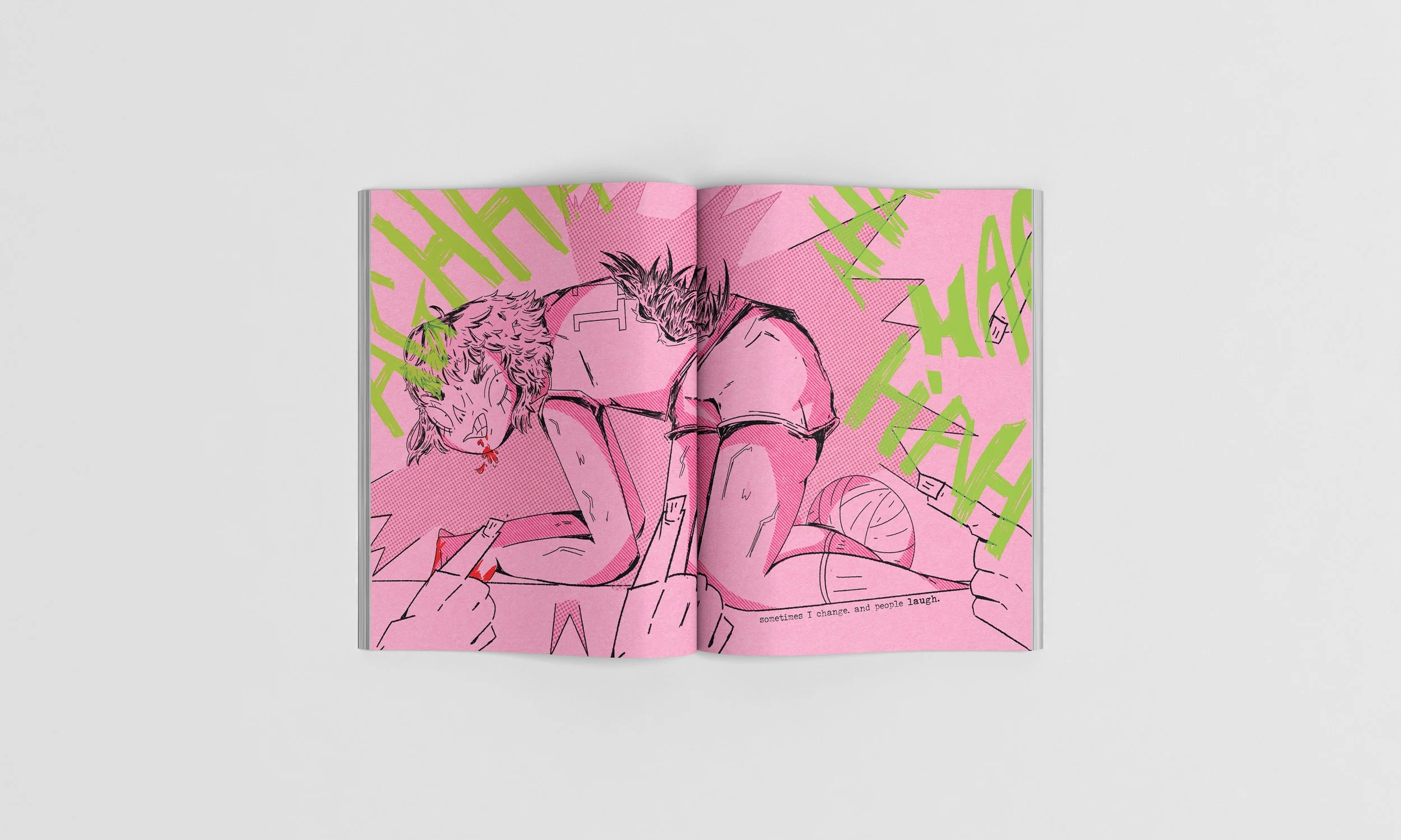
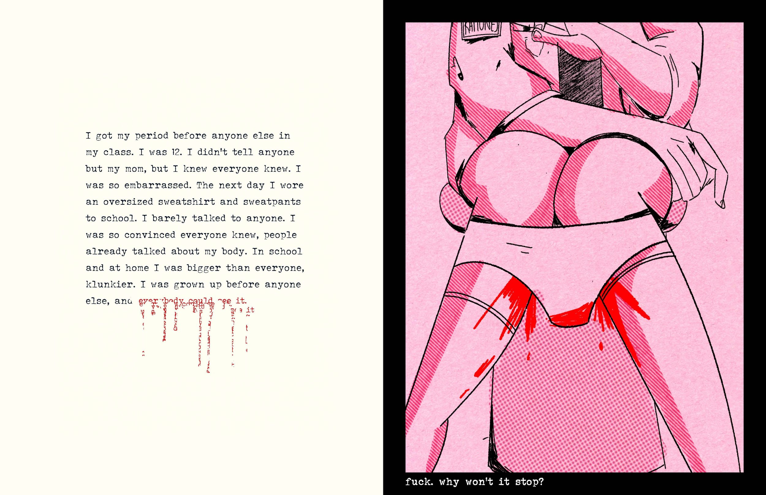
Girl Talk uses a combination of illustration, typography and hand lettering to create dynamic and unsettling spreads. A limited palette was used to create a cohesive look, and scratchy textures or splashes of red were used to emphasize the raw anger and emotion explored in the zine. The end result is a homage to Riot Grlll culture and zines from the 90s in a unique style that's true to my experiences.
Art Instructor: Sean McCabe, Tyler School of Art and Architecture, Temple University
Publishing, Illustration, Typography, Layout
“Well, its uh – interesting. Did there need to be so much blood?”
— My Parents


My research for this project included watching a variety of horror movies and coming of age movies/tv shows, noting motifs, metaphors and emotions prevalent throughout. At the end of my project, I used stills from these movies and shows as thank you cards (below). I also looked to zines from the Riot Grrrrl movement as inspiration. I was particularly inspired by Kathleen Hannah’s Riot Grrrrl Manifesto: Acknowledge emotional violence as real.
RESEARCH


MOODBOARDS


The final spreads were heavily informed by a use of thumbnails and loose sketches that express emotions of terror and pain. Elements like line weight, color and texture were explored later. But the sketches remain the foundation of what makes this project sucessful. Sketches went through many rounds as a way to explore more dynamic compositions, which are showing the final product
SKETCHES


TYPE AND STYLE
The typography is a mix of typewriter typefaces and hand lettering. The type often varies in size and weights to emphasize expletives or important ideas. Hand lettering was used to show screaming, anger, and introduce the main 3 sections of the zine. Cutting out type and resizing it was also explored as a way to pay homage to zines. Colors were from a limited palette of black, off white, and pink. Halftones were used to give depth to certain areas.

Once the project was completed a run of 25 issues was printed. Each issue is 11*17 flat and packaged with a handwritten thank you card. I was able to sell my entire initial run. This project taught me unique ways to approach type, storyboarding/thumb nailing, and helped me to develop my own style when it comes to figures and environments.