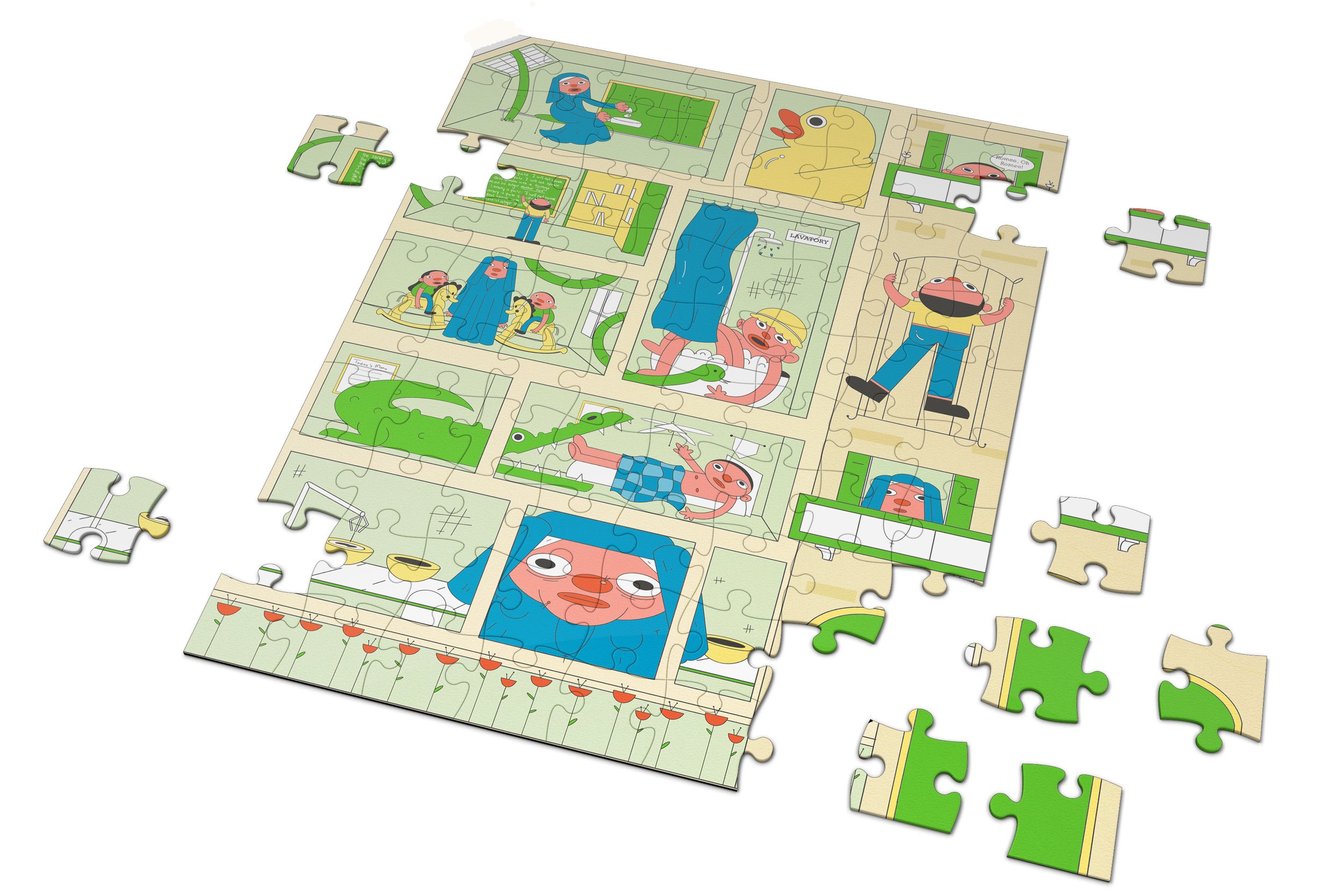
Puzzle Palace’s “Fun with the Nuns” is a puzzle loosely – and I mean loosely – inspired by my grandmother’s time as an orphan at a Catholic convent in Paris. Stories like how she met my grandfather and mean nuns were blended with an absurdist sense of humor to create a unique illustration in puzzle format. Bold lines, flat colors, and a slight texture were used to give a more lighthearted approach to a serious topic. Packaging and branding work with the illustration in a bold, clean way that doesn’t overpower each other.
PUZZLE PALACE
FUN WITH THE NUNS
Art Instructor: Kelly Thorn
Illustration, Branding, Packaging
Illustrations were kept flat, bold and with a limited palette to emphasize absurdity and humour.
The brand, Puzzle Palace, makes puzzles of cross sections of buildings. For the branding elements of puzzle palace, I wanted it to be bold, simple and fun. A strong sans serif was used to bring out the brands playfulness, and a secondary script is used sparingly to break up such heavy shapes.
Branding
The packaging was meant to be used to frame the illustration. I wanted a pop of color on the side of the box, while keeping the front clean but fun.